ISADORA
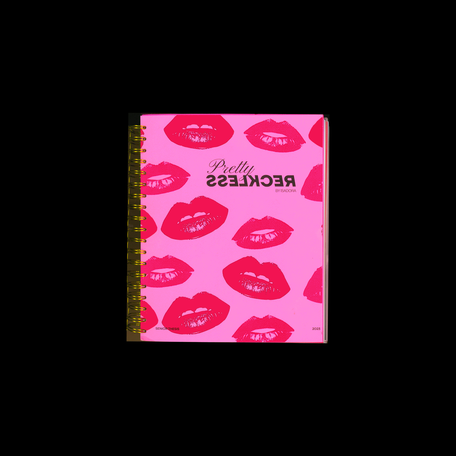
Pretty Reckless
Pretty Reckless is the subject of my Senior Thesis. The idea came from a desire to extend my design beyond digital by incorporating more analog experimentation and focusing on the transition and development of my personal aesthetic. The brand identity was developed and extended to products such as subscription boxes and ephemera such as stickers and matchbooks.

Lifestyle Brand Concept
Experimentation and Development of Pretty Reckless- Senior Thesis
Logo Type
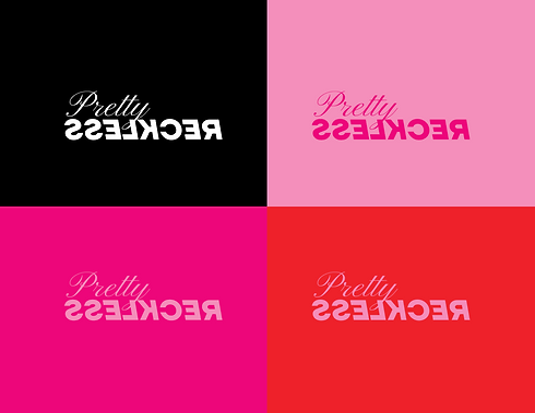
The logo was designed as a type-based mark. The combination of script and the bold san-serif fonts are designed to contrast and the opposing slants provide tension and movement in the mark. The backward 'Reckless' is designed to be legible but to stand outside of normal expectations.
Graphic System
Supporting graphics, typography, and iconography was created to support the new branding for Pretty Reckless. The pink and red primary colors and primary typography were selected to have a feminine feel while the photography collage treatment evoked a hand-made aesthetic. This was all combined to make a flexible modern feminine design system.


Experiements
Experiments were a critical part of the development process of Pretty Reckless. My thesis was a reaction to Covid, not being in person and relying primarily on digital processes. All of my experiments were analog processes- collage, painting and hand drawing a font with honey.


Reckless Fest
Music Festival Concept

Graphic System
Supporting graphics, typography, iconography and patterns were created to support the sub-brand for Reckless Fest. The acidic pink and black primary colors and primary typography were selected to have a strong graphic feel while the duo-tone photo treatment display type evoked a pop art aesthetic.
Poster Series
A 4 part poster series was created using the new branding to highlight the headliners of the festival.


Merchandise
Merchandise was created to extend the identity system of Reckless Fest Music Festival
Identity System
The identity system was also extended to items such as backstage passes and tickets.
